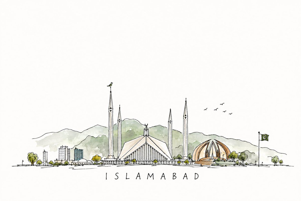
Create a premium hand-painted watercolor city skyline illustration of [CITY NAME], inspired by contemporary architectural travel-poster artwork and traditional watercolor-on-paper techniques.

SUBJECT & LANDMARKS

Construct one elegant panoramic skyline featuring the most recognizable architectural landmarks of [CITY NAME].

Include:

[LANDMARK 01]

Arrange the landmarks into a single cohesive horizontal city silhouette, rather than isolated buildings.

Preserve the recognizable proportions, rooflines, towers, domes, spires, bridges, monuments, and distinctive architectural profiles of the city, while simplifying small details into expressive watercolor shapes.

The skyline should immediately communicate [CITY NAME] without requiring photorealism.

ART STYLE

Use an authentic architectural watercolor silhouette aesthetic.

Combine:

Transparent watercolor washes
Wet-on-wet pigment diffusion
Wet-on-dry architectural edges
Natural pigment blooms
Granulation
Soft color bleeding
Uneven pigment density
Dry-brush marks
Rough painted edges
Small watercolor splashes
Fine paint droplets
Accidental-looking pigment marks
Subtle paint pooling
Slight paper absorption
Hand-painted imperfections

The result should feel genuinely painted with watercolor rather than digitally airbrushed.

SILHOUETTE TREATMENT

Render the architecture primarily as filled watercolor silhouettes.

Buildings should contain varying pigment density:

Some areas nearly opaque
Some areas semi-transparent
Some edges sharply defined
Other edges softly bleeding into the paper

Allow selected architectural details such as windows, arches, structural openings, bridge cables, columns, domes and spires to appear through negative space and minimal fine watercolor detailing.

Avoid excessive outlines.

COLOR SYSTEM

Use a vibrant multi-hue watercolor gradient flowing organically across the skyline.

Suggested palette:

[PRIMARY COLOR] → [SECONDARY COLOR] → [ACCENT COLOR] → [FINAL COLOR]

Example:

Turquoise → Cobalt Blue → Violet → Magenta → Crimson → Warm Orange

Do not create a perfectly digital gradient.

Instead, allow neighboring watercolor pigments to naturally mix, overlap and bleed into each other.

Create occasional concentrated bursts of saturated pigment surrounded by lighter translucent washes.

BASE PAINT STROKE

Below the architecture, create a broad expressive horizontal watercolor brush stroke.

The stroke should:

Visually anchor the skyline
Extend irregularly beyond some buildings
Contain visible brush texture
Have broken edges
Include dry-brush gaps
Produce small paint splatters
Create several isolated pigment droplets
Fade naturally into the paper

Integrate the lower portions of some buildings into this painted stroke so the skyline feels physically painted from the same pigments.

COMPOSITION

Use a clean editorial travel-poster composition.

Place the skyline horizontally across approximately 65–80% of the canvas width.

Maintain generous negative space around the illustration.

Keep the tallest landmark close to the visual center or a rule-of-thirds intersection.

Balance large monuments with smaller surrounding architecture.

Avoide overcrowding.

The skyline should remain readable even at thumbnail size.

TYPOGRAPHY

Place the city name:

"[CITY NAME]"

near the skyline.

Use an elegant thin condensed uppercase display typeface with subtle Art Deco / editorial characteristics.

Typography should be:

Correctly spelled
Crisp
Minimal
Refined
Narrow
Lightweight
Well kerned
Secondary to the artwork

Use a color sampled from the watercolor illustration.

Optional small secondary text:

"[COUNTRY / YEAR / COLLECTION NAME]"

Keep secondary typography extremely minimal.

PAPER & BACKGROUND

Background: warm off-white watercolor paper.

Use realistic cold-pressed watercolor paper with:

Fine visible fibers
Subtle grain
Slight surface irregularity
Very gentle natural tonal variation

Suggested background:
#F5F2EA / warm ivory

The paper texture should remain understated and must not overpower the skyline.

LIGHTING & PRESENTATION

Flat artwork reproduction with extremely soft ambient illumination.
No dramatic environmental lighting.
No artificial drop shadows.
The artwork should look like a professionally photographed or scanned watercolor print.

VISUAL HIERARCHY

Viewing order:

Recognizable city skyline
Major landmark
Watercolor color transitions
City-name typography
Fine splashes and paper texture

Maintain a sophisticated balance between architectural recognition and expressive abstraction.

QUALITY

Premium editorial illustration
Museum-print quality
High-resolution watercolor detail
Clean architectural proportions
Natural pigment behavior
Fine paper texture
Sophisticated color transitions
Professional travel-poster aesthetic
Crisp recognizable silhouette
Organic handmade imperfections

NEGATIVE PROMPT / AVOID
Avoide photorealistic buildings, 3D rendering, CGI, vector-flat gradients, cartoon styling, thick black outlines, neon glow, cyberpunk lighting, excessive shadows, glossy surfaces, plastic textures, perfectly smooth digital gradients, excessive paint splatter, chaotic composition, illegible architecture, duplicated landmarks, distorted buildings, floating structures, random objects, fake logos, watermarks, misspelled city names, excessive text, cluttered backgrounds or decorative frames.

OUTPUT
Aspect ratio: [16:9 / 3:2 / 4:5 / 9:16]
Background: warm off-white textured watercolor paper
Composition: centered panoramic architectural silhouette
Style: expressive architectural watercolor
Detail: high
Text: "[CITY NAME]" only, unless additional text is specifie
 定格AI图像工坊
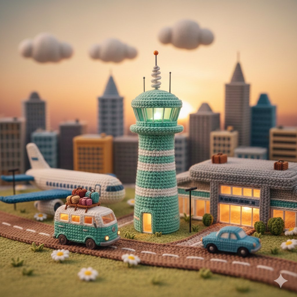 A highly detailed miniature diorama entirely made of crochet
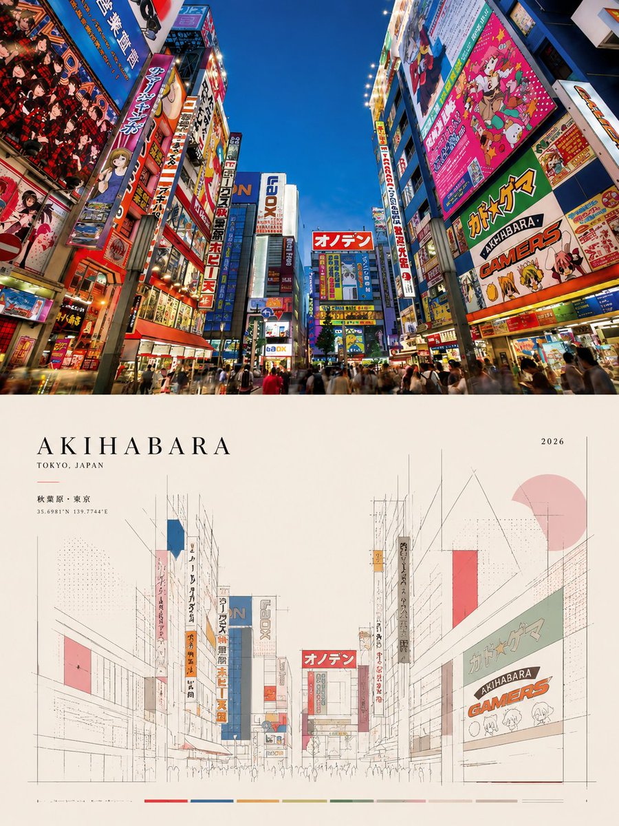 Create an ultra-high-resolution, print-ready editorial poste
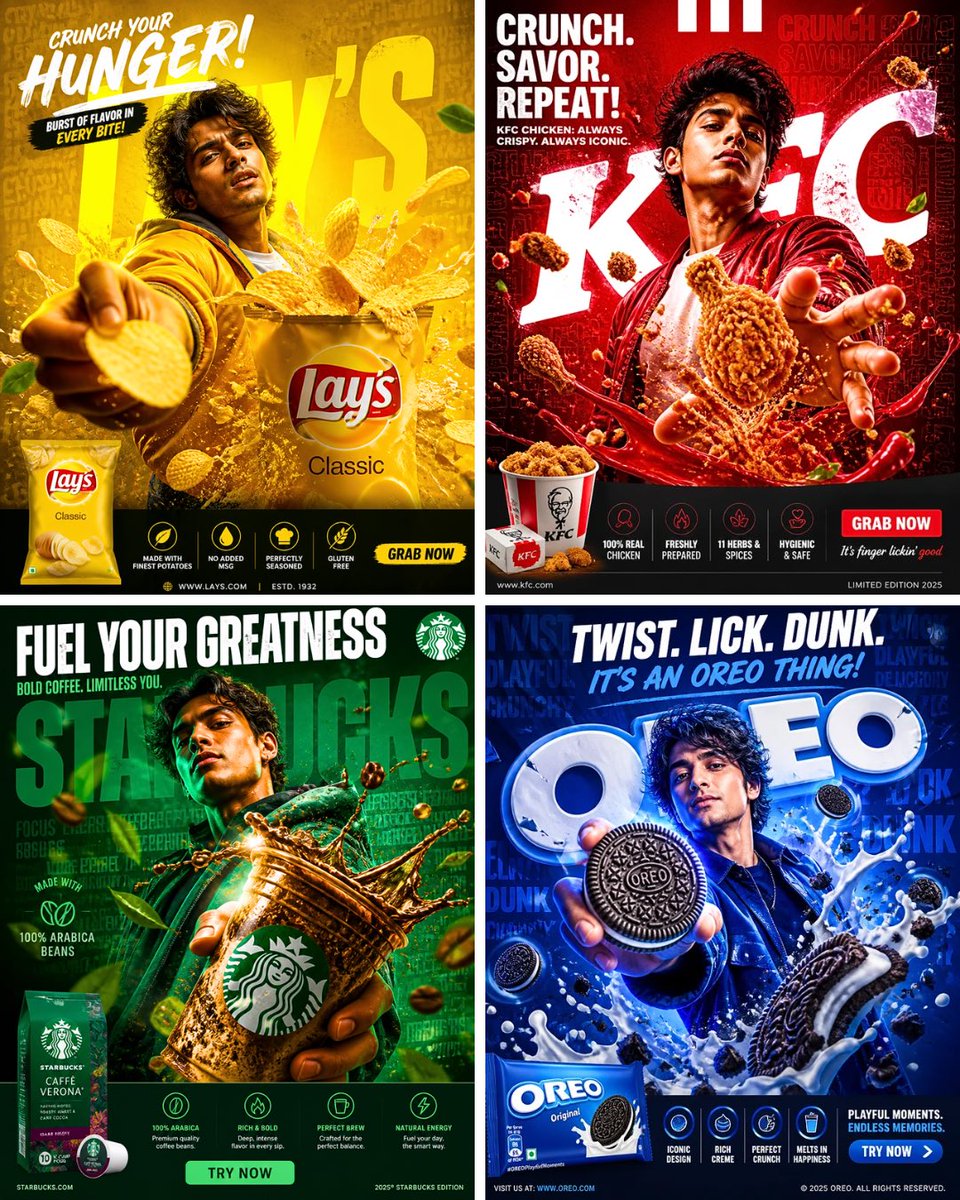 A high-impact cinematic advertising poster for [BRAND]. A yo
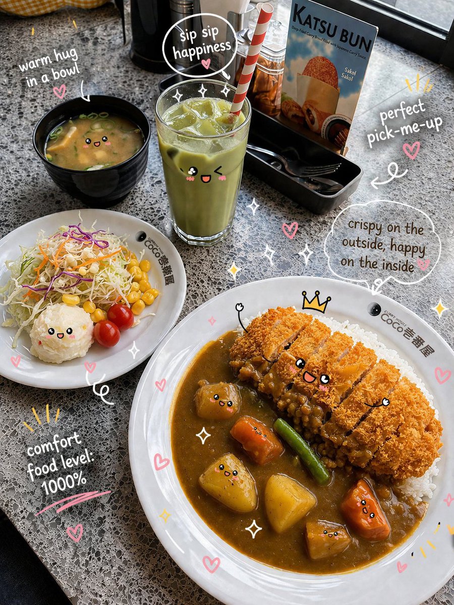 Prompt. { "scene": { "type": "food_photography",
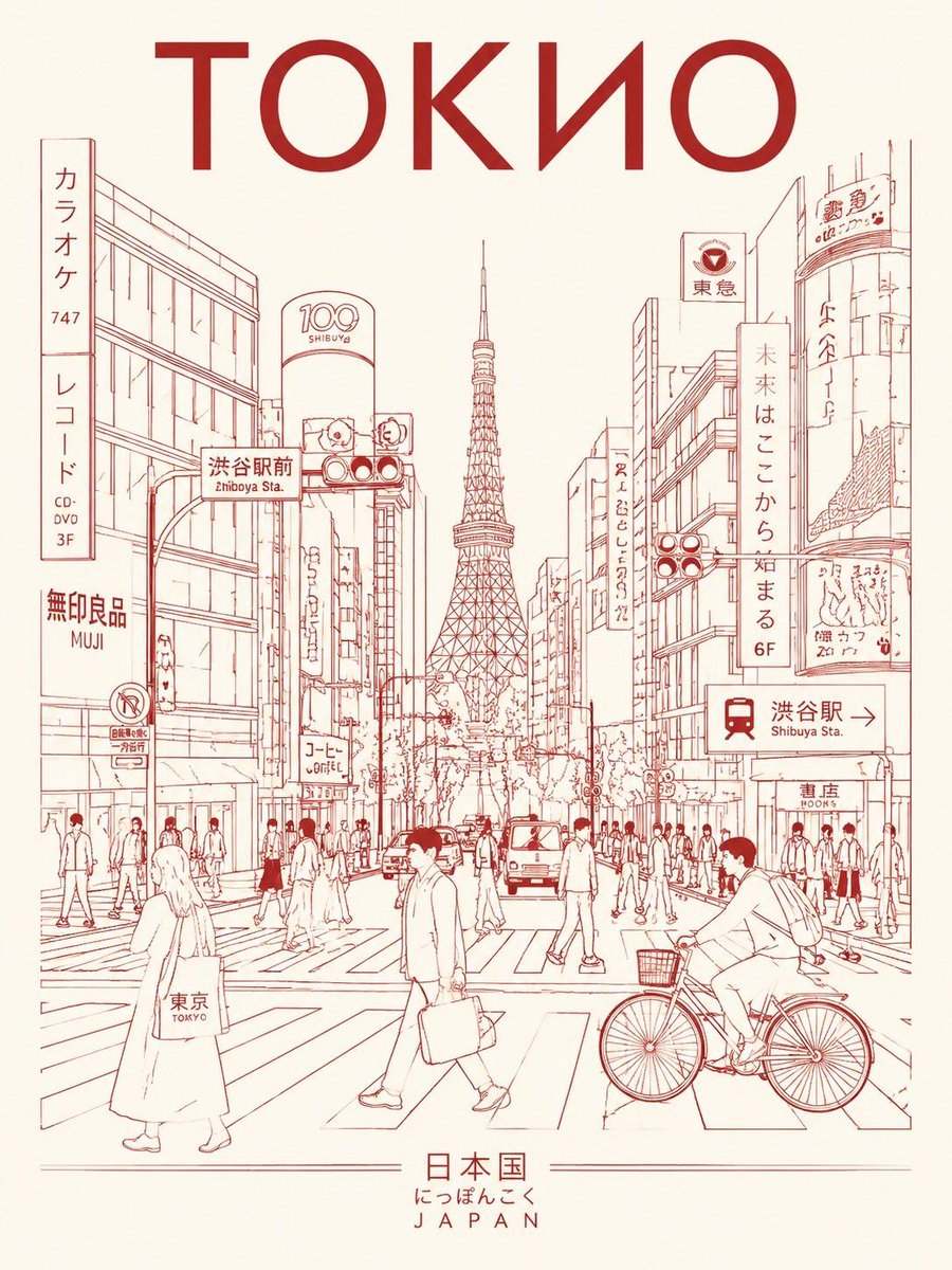 Create a minimalist ultra-high-resolution travel poster in l
 Wide editorial lifestyle shot, young woman in sheer emerald
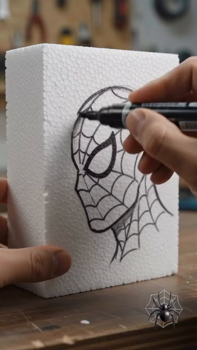 Create a highly realistic vertical 9:16 cinematic time-lapse
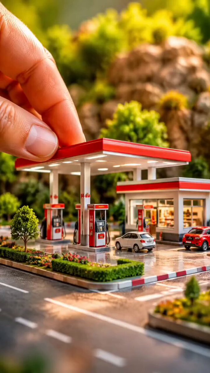 Create a 60-second ultra-realistic macro miniature construct