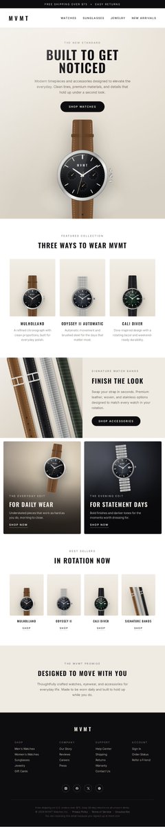
Create a full-length, tall vertical ecommerce email mockup for MVMT, a modern watch and accessories brand for millennials.

Design a highly realistic premium DTC email that feels sleek, polished, minimal, masculine-leaning, and editorial. The final image should look like a real designer-made ecommerce email screenshot, not a poster, not a landing page, and not a generic template.

Brand vibe:
Modern California-cool, youthful, confident, clean, aspirational, stylish, and elevated. The design should feel luxury-adjacent but still accessible.

Feature these products prominently:
- Mulholland
- Odyssey II Automatic
- Cali Diver
- Signature Watch Bands

Visual style:
- clean premium ecommerce design
- refined editorial layout
- realistic product photography
- subtle lifestyle imagery
- strong hierarchy
- crisp sans-serif typography
- generous spacing
- subtle shadows
- restrained modern color palette

Color palette:
Black, white, charcoal, warm gray, stone, soft beige, brushed metal tones, and subtle muted accents. Keep the palette neutral and premium.

Important creative direction:
This should feel like a polished watch-brand email campaign with strong design taste. Prioritize realism, elegance, and clarity. Make it feel like something MVMT could actually send.

Build the email in this order:

1. Top promo bar
A thin black or dark charcoal bar across the top with small uppercase text:
“FREE SHIPPING OVER $75 + EASY RETURNS”

2. Header
A clean white header with the MVMT wordmark/logo on the left and minimal navigation links on the right or centered:
WATCHES
SUNGLASSES
JEWELRY
NEW ARRIVALS

3. Hero section
A premium hero section with strong visual balance.
Use a bold headline:
“BUILT TO GET NOTICED”
Include short supporting copy about modern timepieces and accessories designed to elevate everyday style.
Add a dark rounded CTA button:
“SHOP WATCHES”

Hero imagery should include:
- one dominant premium watch image
- subtle luxury lifestyle imagery
- a stylish male model or fashion-forward masculine lifestyle scene
- modern lighting and clean composition

4. Featured collection section
Add a centered section headline:
“THREE WAYS TO WEAR MVMT”
Below it, show three clean product cards or image blocks featuring:
- Mulholland
- Odyssey II Automatic
- Cali Diver

Each block should include:
- product image
- product name
- short one- or two-line description
Keep this section symmetrical, polished, and premium.

5. Accessory banner
Add a refined split section titled:
“FINISH THE LOOK”
Feature Signature Watch Bands.
Show premium close-up imagery of watch straps or interchangeable bands.
Include short supporting copy and a dark CTA button:
“SHOP ACCESSORIES”

6. Editorial promo tiles
Add two side-by-side promotional tiles with image-led design.
Tile one headline:
“FOR DAILY WEAR”
Tile two headline:
“FOR STATEMENT DAYS”
Each tile should have short copy and a small CTA:
“SHOP NOW”

These tiles should feel like editorial brand moments, not generic sale boxes.

7. Shoppable row
Add a section titled:
“IN ROTATION NOW”
Show a clean 4-item product row or grid featuring:
- Mulholland
- Odyssey II Automatic
- Cali Diver
- Signature Watch Bands

Each item should include:
- isolated product image
- product name
- small “SHOP” link or button

8. Brand signoff
Add a centered message block with the headline:
“DESIGNED TO MOVE WITH YOU”
Include a short line about thoughtfully crafted watches, eyewear, and accessories for everyday life.

9. Footer
Create a realistic black or charcoal branded footer with:
- MVMT logo
- shop links
- company links
- support links
- social icons
- small legal and shipping text

Typography direction:
Use bold condensed or modern sans-serif typography for major headlines and clean sans-serif body text. Headlines should feel sharp, modern, and fashion-forward. Body copy should look realistic and mostly legible.

Photography direction:
Use premium product photography with realistic reflections, polished materials, soft shadows, and clean surfaces. Lifestyle photography should feel elevated, modern, and fashion-oriented.

Composition rules:
- tall vertical email format
- clear section separation
- realistic email proportions
- strong hierarchy
- mostly legible text
- premium spacing
- intentional alignment
- balanced mix of product and lifestyle imagery

Avoid:
- messy collage styling
- playful scrapbook aesthetics
- overly colorful design
- cheap template vibes
- cartoonish imagery
- cluttered layouts
- fake-looking UI elements
- poster-style composition
- excessive promotional chaos

Output:
A full-length, vertically composed, highly realistic ecommerce email design mockup for MVMT that feels premium, clean, polished, modern, editorial, and presentation-ready.
 定格AI图像工坊
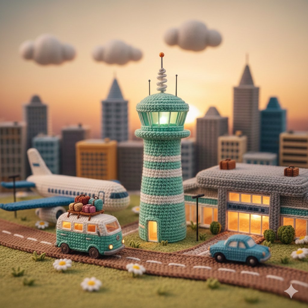 A highly detailed miniature diorama entirely made of crochet
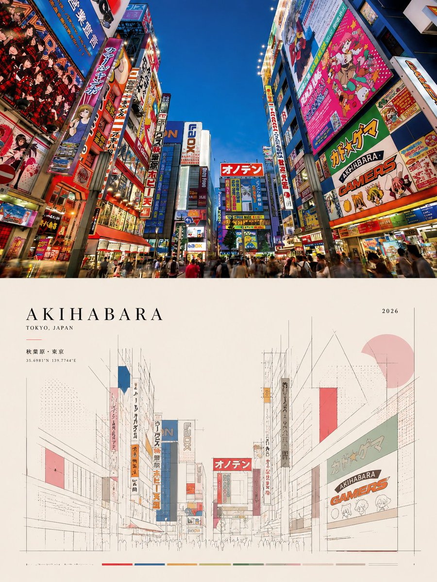 Create an ultra-high-resolution, print-ready editorial poste
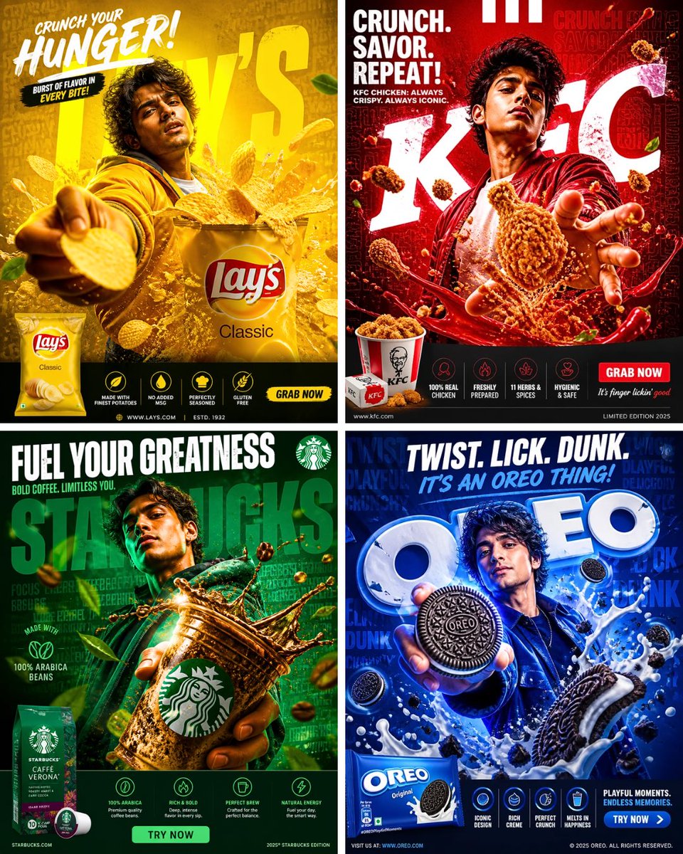 A high-impact cinematic advertising poster for [BRAND]. A yo
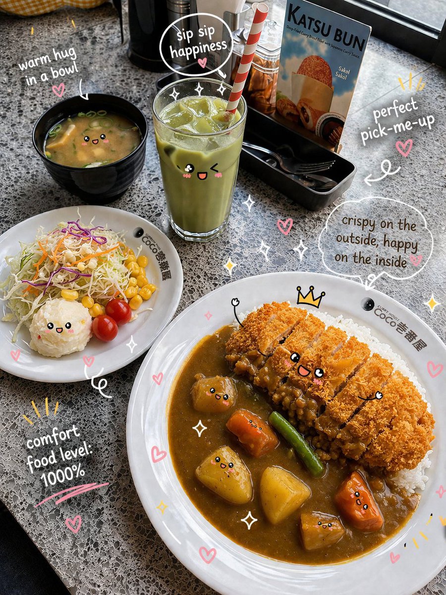 Prompt. { "scene": { "type": "food_photography",
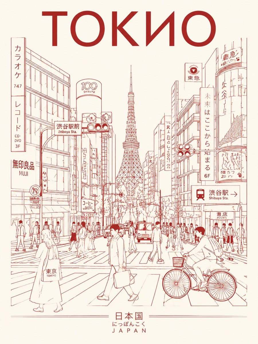 Create a minimalist ultra-high-resolution travel poster in l
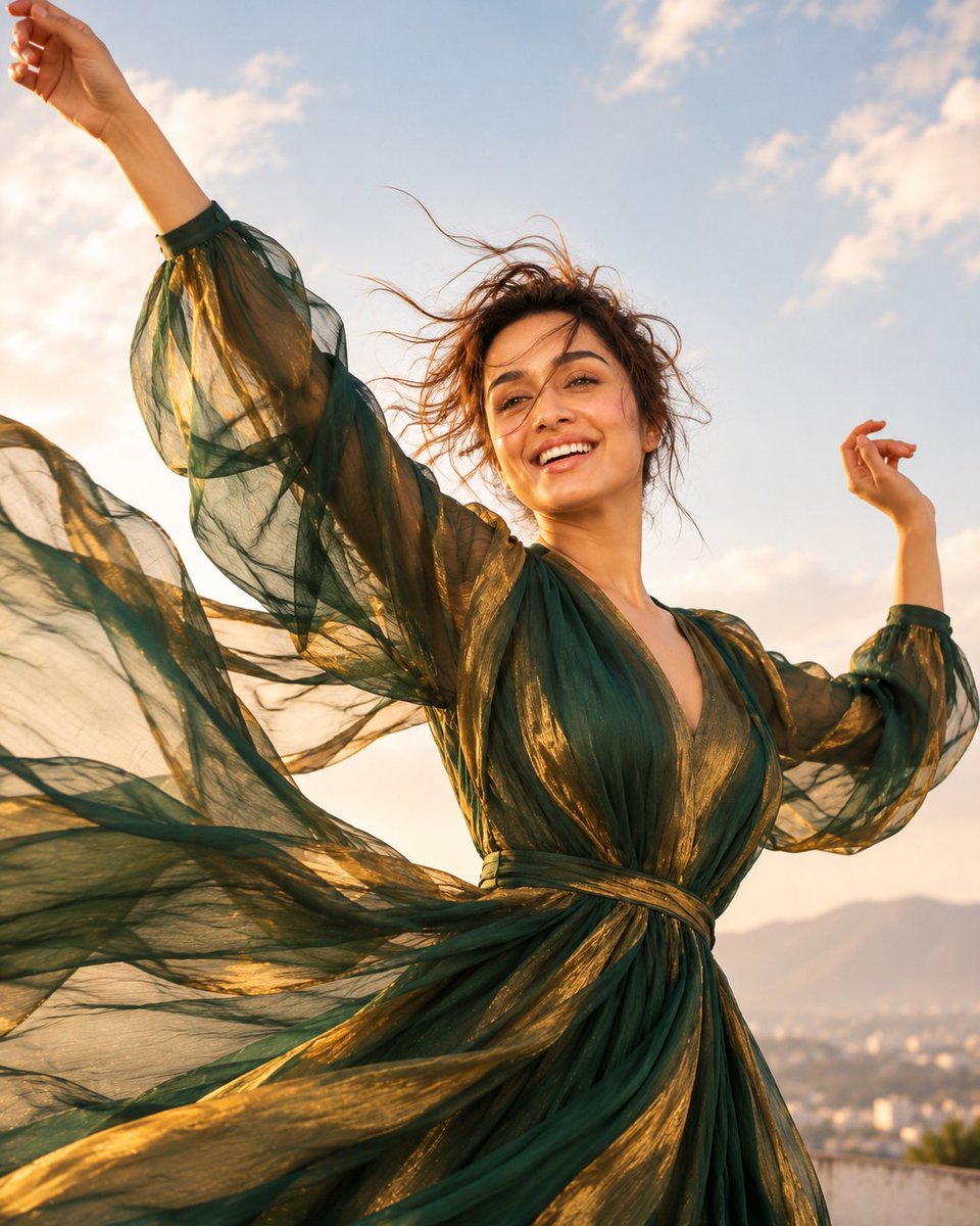 Wide editorial lifestyle shot, young woman in sheer emerald
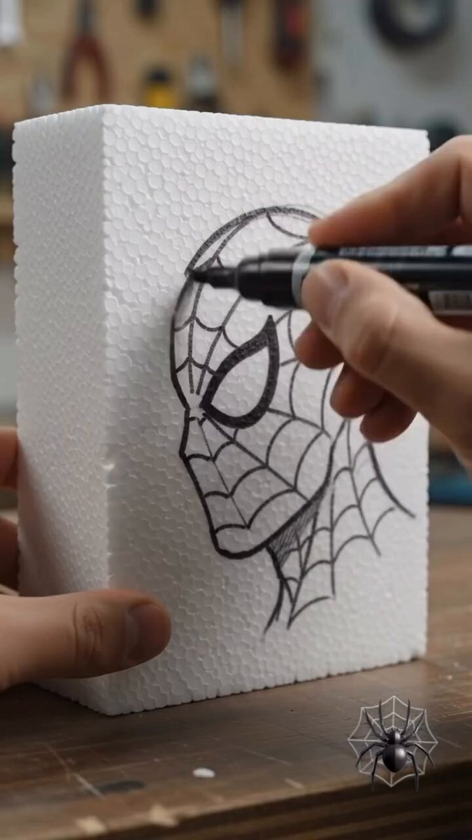 Create a highly realistic vertical 9:16 cinematic time-lapse
 Create a 60-second ultra-realistic macro miniature construct